The colour palette chosen for the painting of GB School in Melmaruvathur reflects a harmonious blend of modernity and vibrancy while maintaining a serene and conducive learning environment.
The strategic use of vibrant yet calming tones brings life to the educational spaces and enhances the atmosphere of creativity and focus for students and educators alike. The primary colours are carefully selected to invoke a sense of energy and positivity.
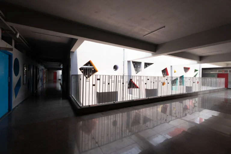
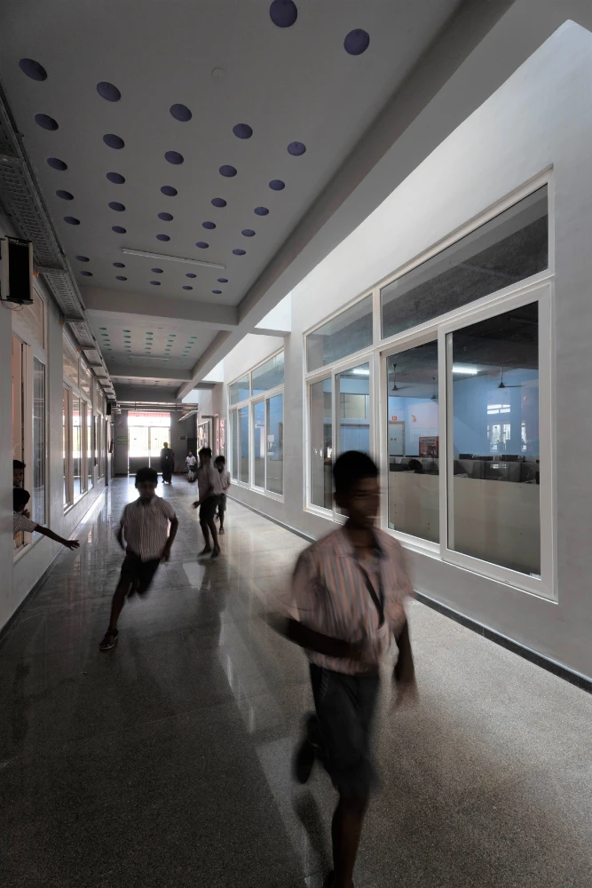
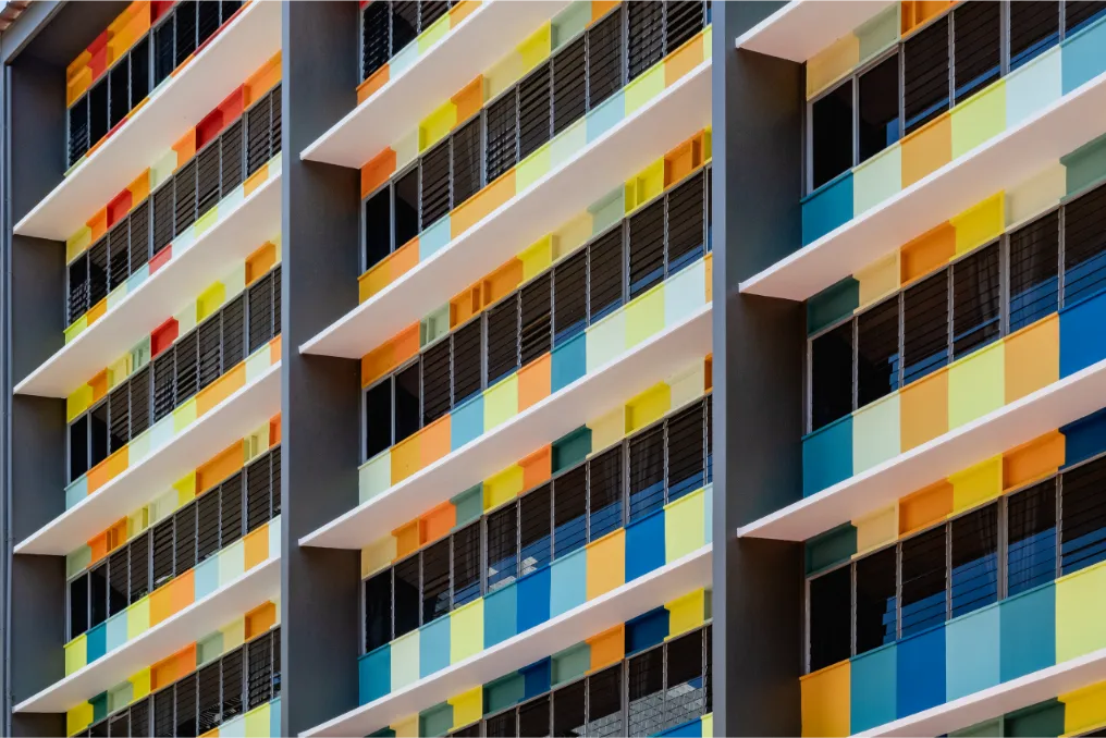
Bright shades of yellow were used on accent walls, bringing a lively and energetic feel that stimulates creativity and enthusiasm in the students.
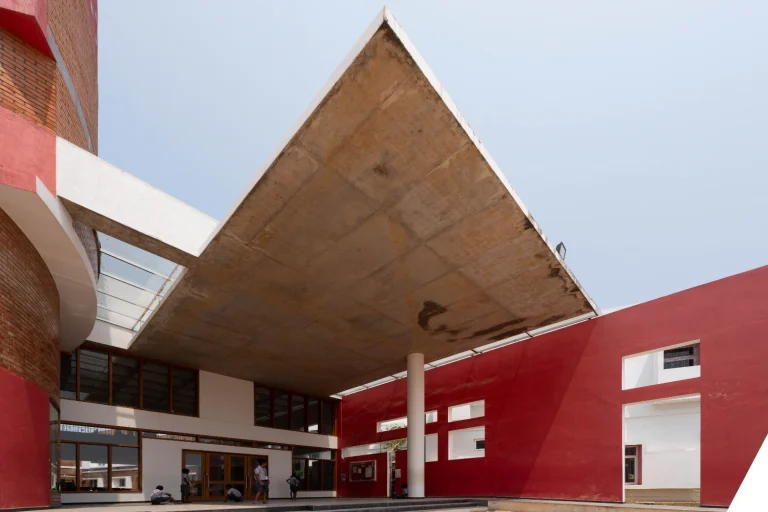
Located in Tamil Nadu, India
Submitted by Murali Architects
Finalists 2025, Grand Prix 2025, Winner 2025
Colour Codes
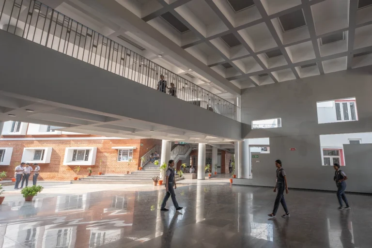
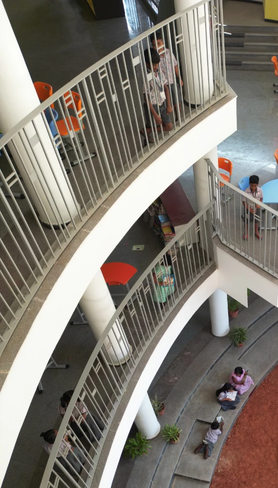
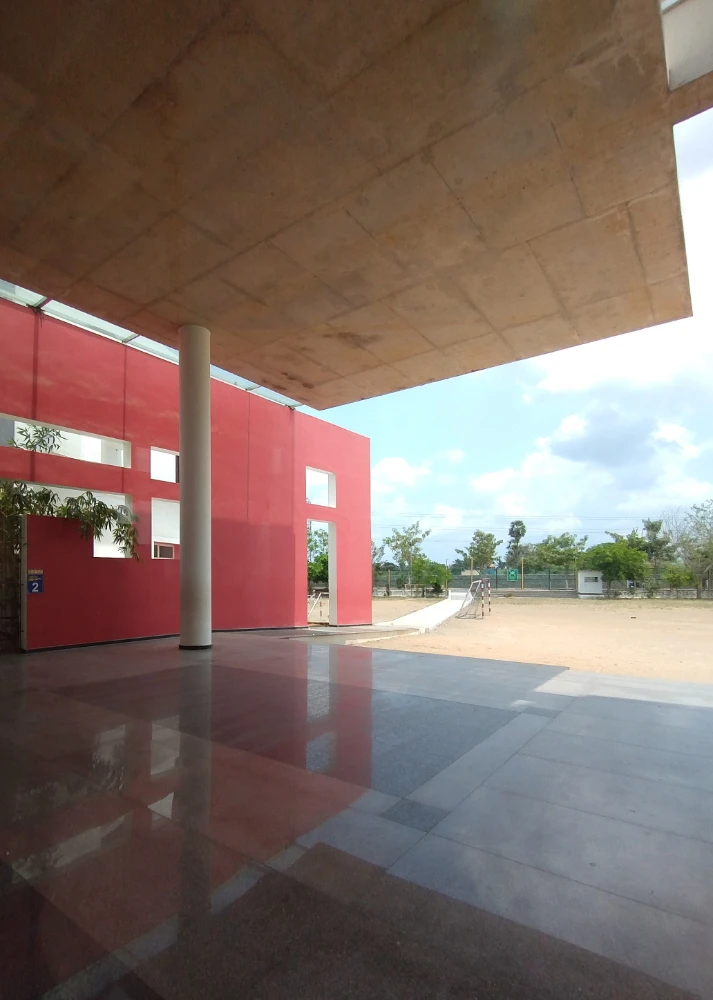
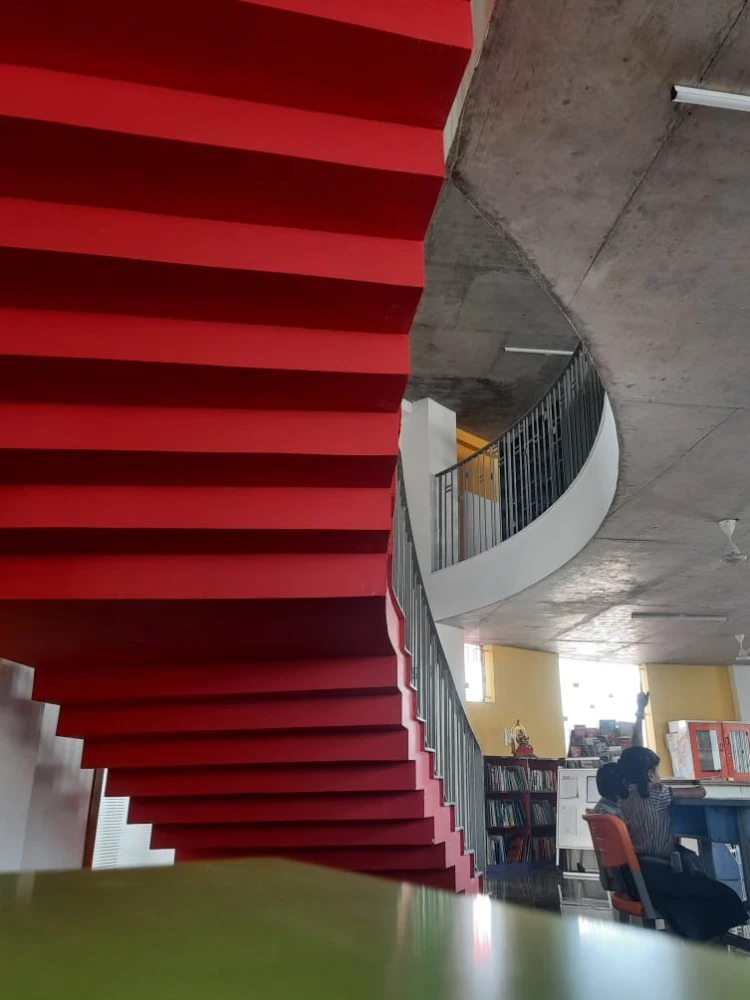
Soft blues and greens are present on the larger walls, which evoke calmness and tranquillity, promoting focus and concentration. These cooler tones balance the brightness, ensuring that the environment remains peaceful and conducive to learning. In areas that require a touch of elegance, muted neutrals like light beige and soft greys were used to create a sense of sophistication without overwhelming the space. These neutral tones provide a grounding element, offering a perfect backdrop for the more vibrant colours to stand out while maintaining a polished, modern aesthetic. Accents of orange and red are used sparingly in specific zones to inspire motivation and passion.
These colours, applied to key focal points like corridors and activity rooms, help create an engaging environment that encourages interaction and fosters a sense of community within the school. The strategic use of these colours reflects an intentional design approach, focusing on both the psychological effects of colour and the school’s vision of fostering an inspiring, productive, and positive educational experience.
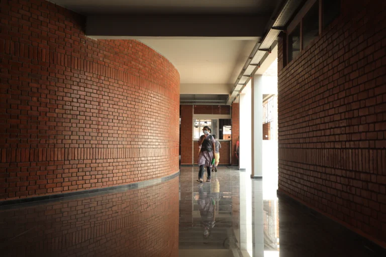
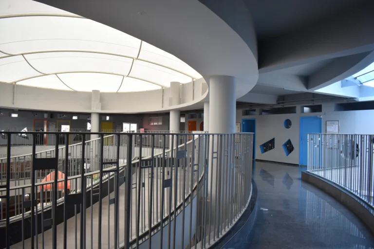
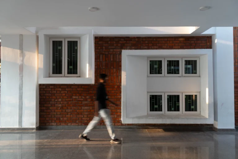
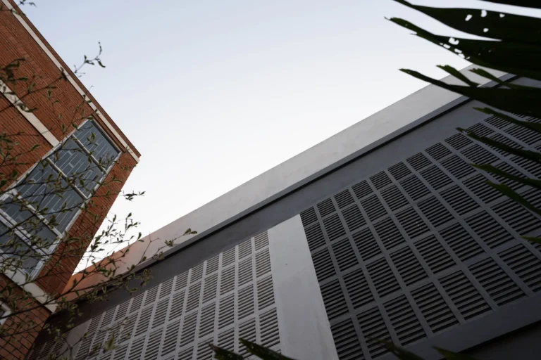
GB School
The use of Nippon Paints ensures not only the aesthetic quality of the spaces but also durability and eco-friendliness, making it the perfect choice for the school’s painting project.
"The colours used blend vibrancy and calm to create a dynamic yet focused learning environment. Bright yellows energize, while soft blues and greens promote tranquillity and concentration. Muted neutrals like beige and grey add sophistication, and accents of orange and red inspire motivation. The strategic colour choices foster creativity, focus, and community, enhancing the school’s atmosphere. Nippon Paint ensures both aesthetic appeal and durability, supporting a sustainable, engaging educational space."