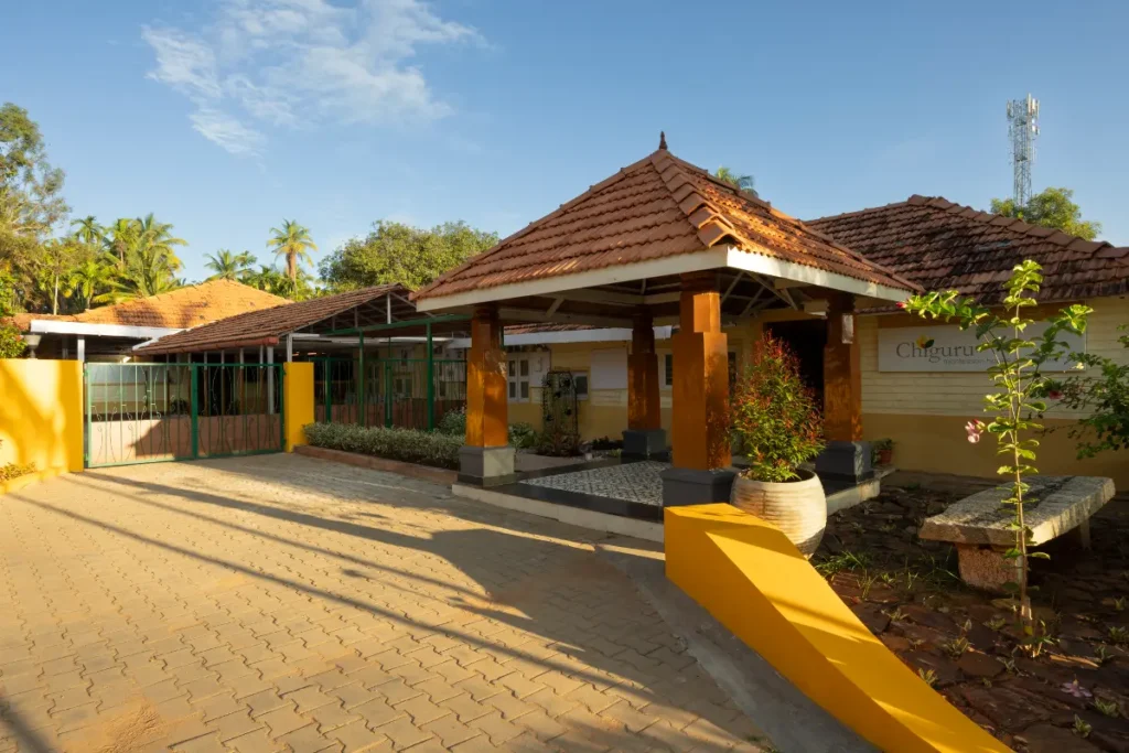
Chiguru—The Montessori learning system comes from home learning environments. Chiguru in the local tongue means a young sapling / plant shoot.
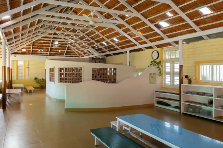
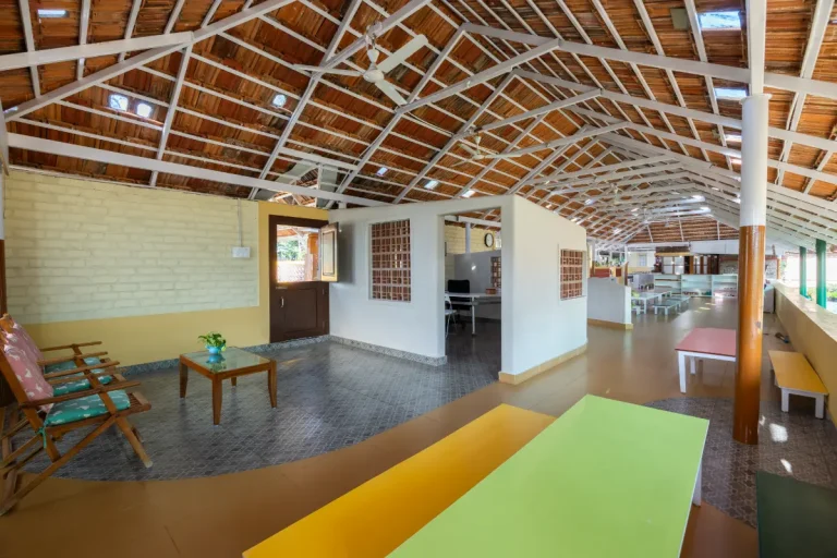
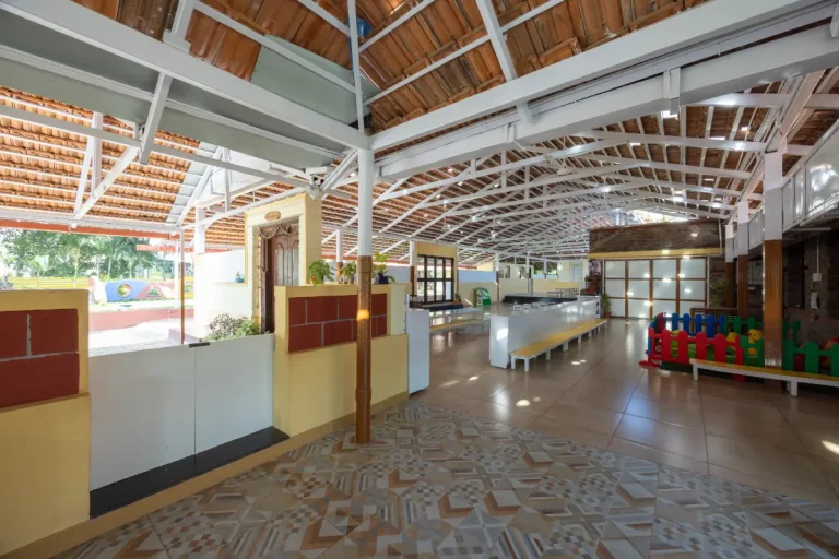
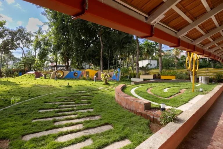
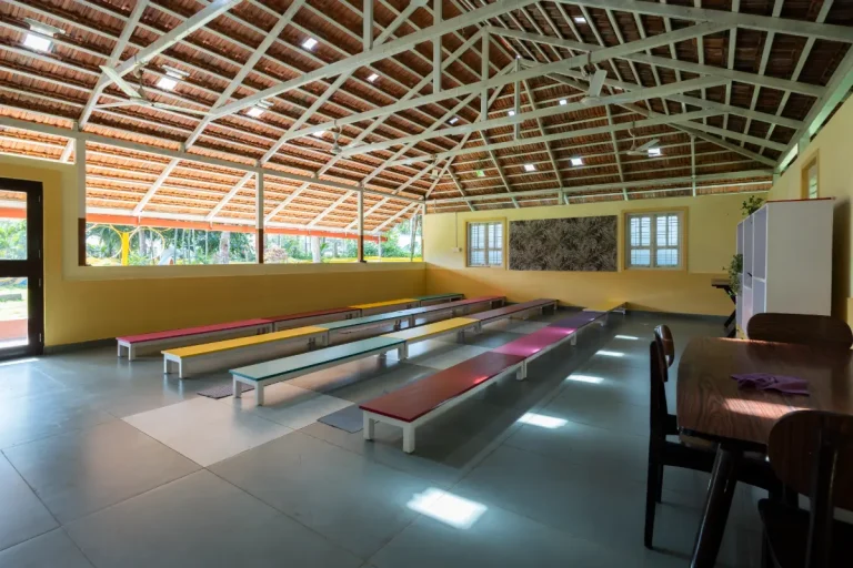
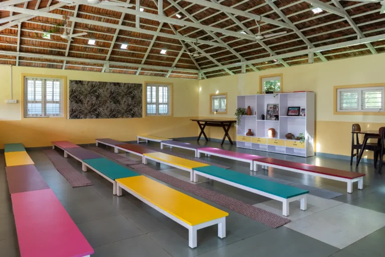
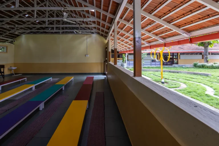
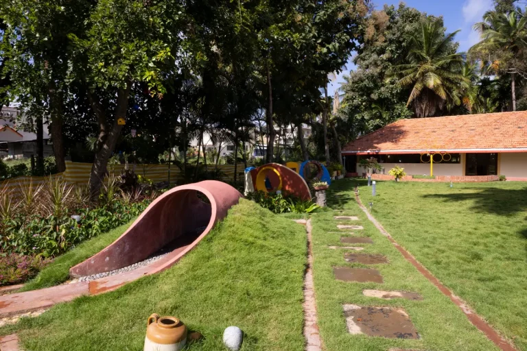
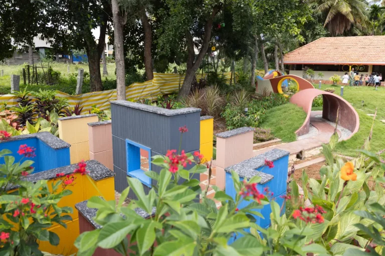
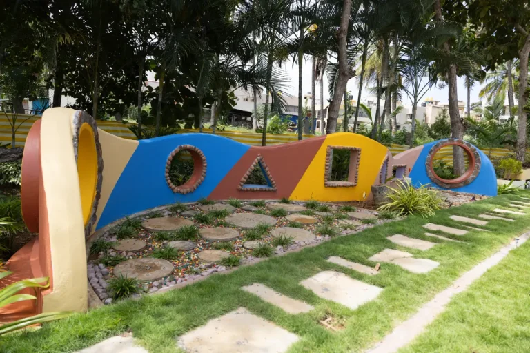
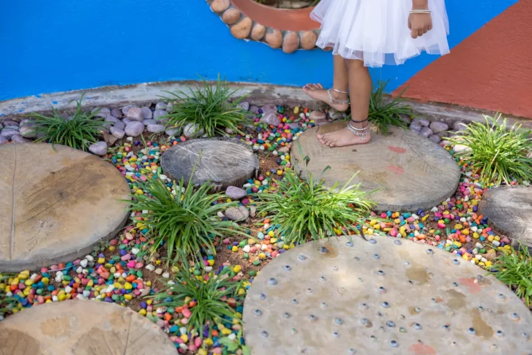
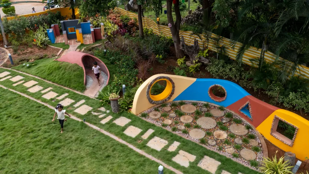
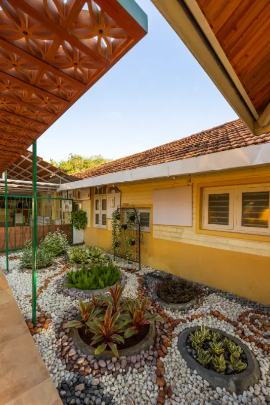
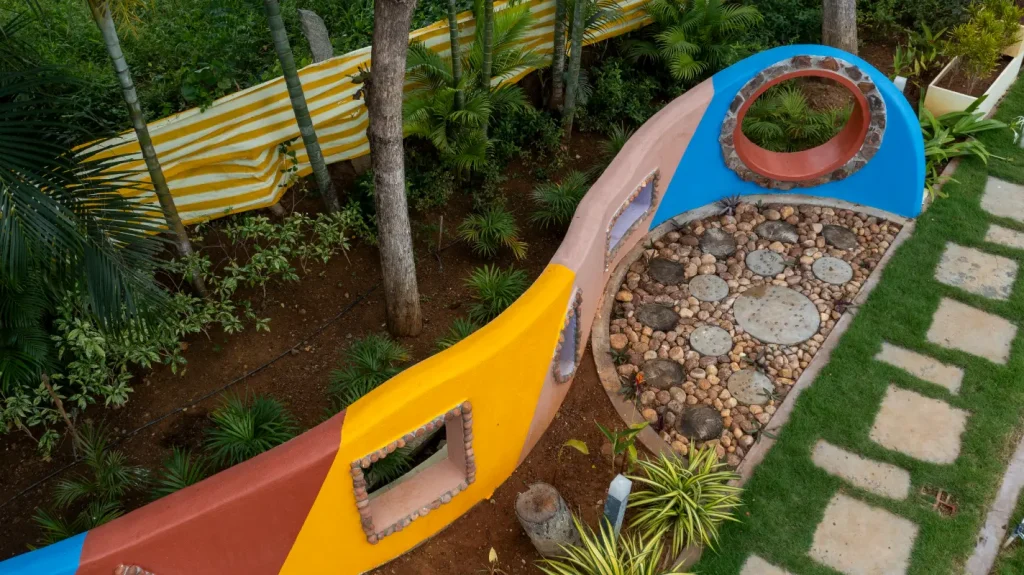
The building’s exterior and interior embrace earthy colors like soft yellow, green, brown, and off-white, creating a bright and welcoming atmosphere. These warm tones beautifully complement the colorful children’s furniture, enhancing the playfulness of the space. In the play area and garden, vibrant primary colors and whimsical characters add a sense of fun and imagination. This thoughtful color scheme not only promotes joy but also fosters creativity, making the environment perfect for children to explore and grow.
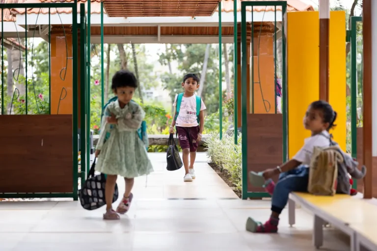
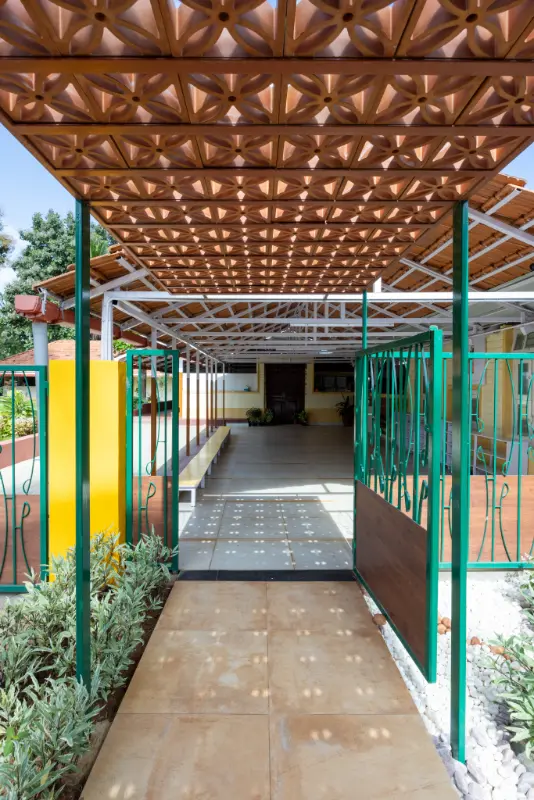
Another point of this project was that there were many Reclaimed Doors, Windows and Roofing Tiles available from Demolished Buildings. We used them in a pattern and in a way the children can see out from their height. The Reception, Office and Unwell Child Bay was carved out of the larger volume. We deliberately made it non rigid, without corners and rounded the edges to soften it... so that it appears subdued for a child.
Located in Bangalore, India
Submitted by Etagi Design Collaborative
Finalists 2025
Colour Codes
The Flooring was originally Red Oxide. We had to use a more maintenance free, patch work friendly material due to the Civil work additions. We chose a nice mustard yellow Flooring with some playful patterns. All these design gestures, finishing materials intend to make the space friendly and less intimidating for a child given that it is a big volume and space.
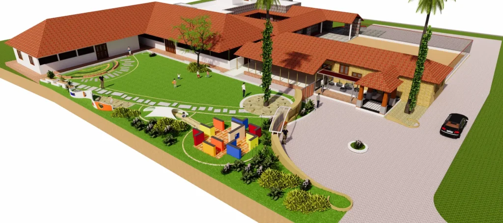
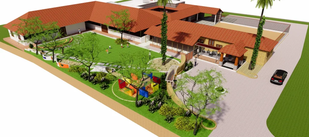
The newest addition came in the way of a Multi Purpose Hall and Dining Room perpendicular to the existing structure. We again reused most materials from the dismantled structure cutting down on the consumption while giving new use to the materials. This new block also houses the Children’s Toilet as well as a small Pantry for the Teaching Faculty. By adding this perpendicular wing to the existing structure, we were able to optimize space and create a couple of new working environments
Chiguru Montessori School
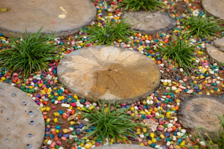
We were also looking to supplement the Indoor Learning Environment with an outdoor landscape / learning environment but it was challenging as it was an open outdoor with a non-fixed / non determinate boundary. The new wing formed a fore court between the Drop Off and itself and gave us an opportunity to create a controlled landscape. The landscape has several smaller theme based play elements and nicely compliments the Built Structure.
"In this project, colour was used to create a bright and welcoming atmosphere. Warm & bright tones complement the colorful children’s furniture, enhancing the playfulness of the space. Vibrancy of primary colors add a sense of fun and imagination fostering creativity, exploration, self-learning and discovery by the kids themselves."