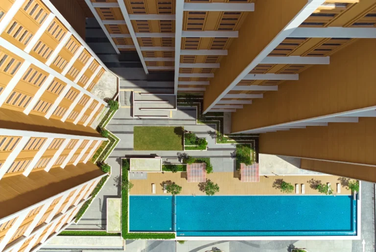
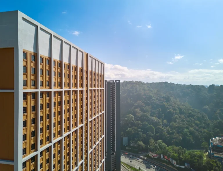
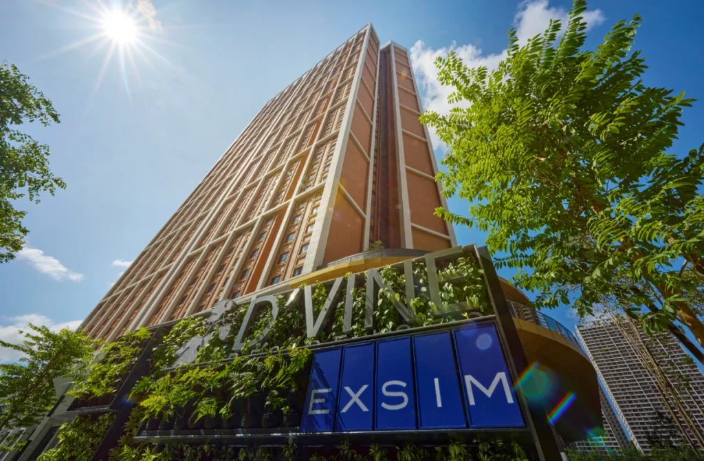
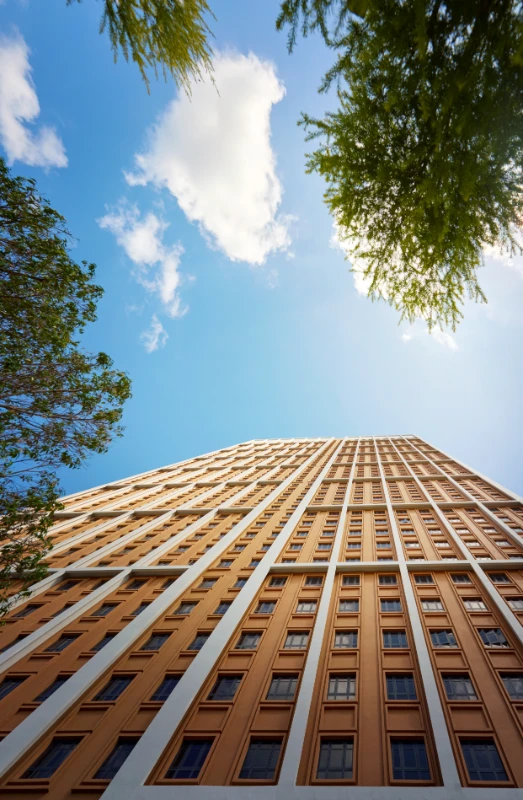
Colour is crucial to D'Vine Residences' character.
The warm, earthy tones reminiscent of classic red brick create familiarity and timelessness within the modern skyline. These colours ground the building in its tropical setting and establish a strong visual identity that complements the surrounding urban landscape.
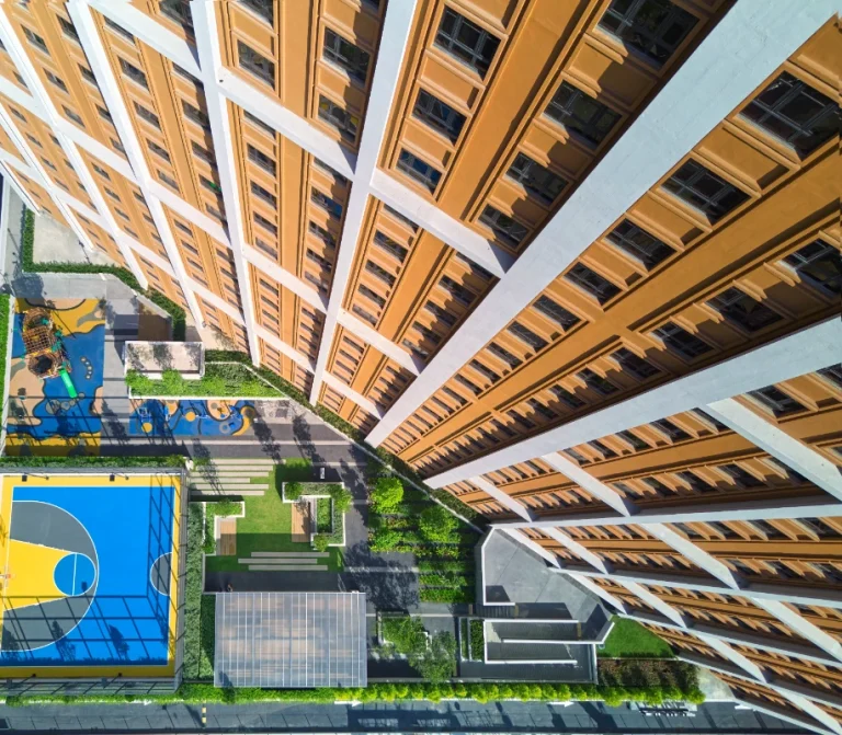
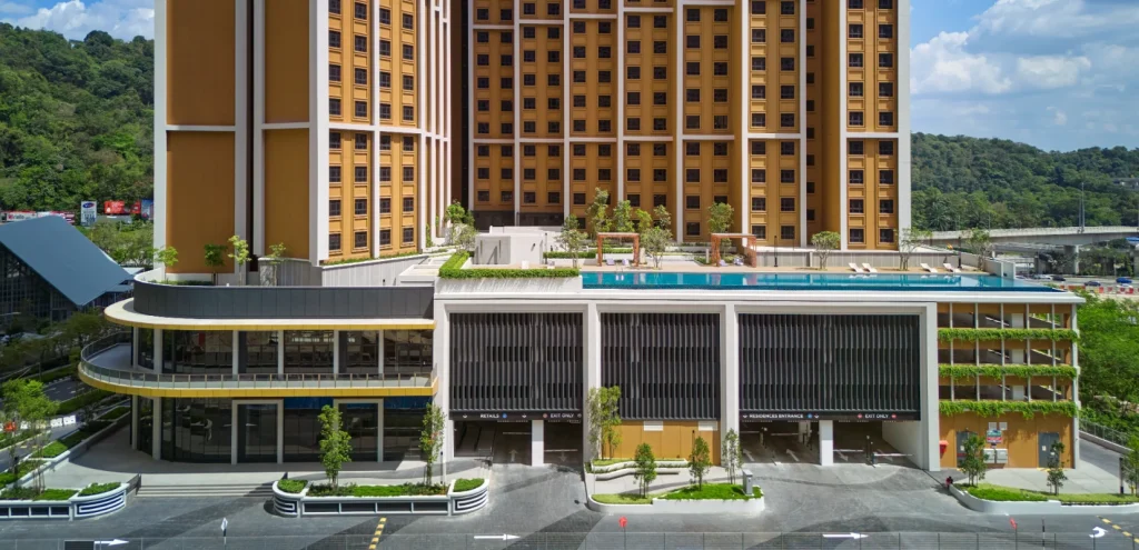
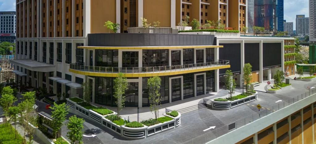
Contrasting hues within the banded framework enhance depth, adding a multifaceted quality to the tower's monolithic form and subtly delineating the building’s various functions. The strategically positioned sculptural retail corner acts as an inviting beacon, enhancing the development's role as an active urban node.
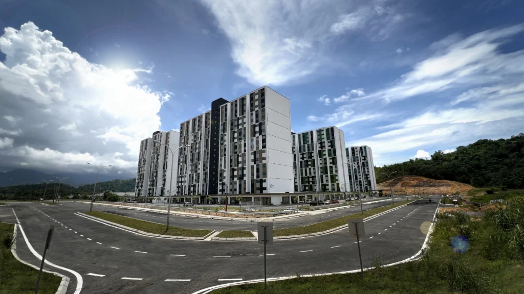
Located in Selangor, Malaysia
Submitted by Ping Ng Architect
Finalists 2025
Colour Codes
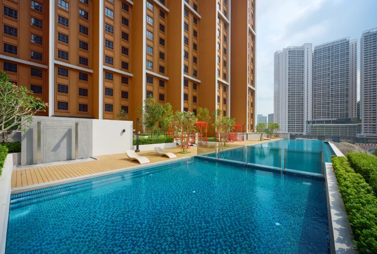
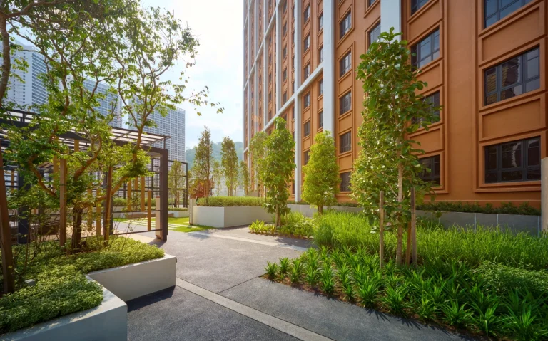
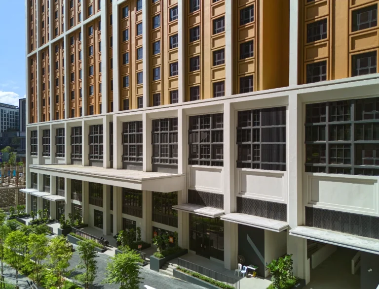
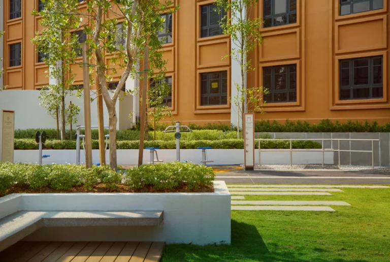
More than just a place to live, D'Vine Residences promotes urban connectivity and inclusivity by embracing a ground-level public realm that encourages interaction and accessibility. The integration of retail frontages and inviting pedestrian pathways strengthens the connection with the surrounding community, creating a vibrant streetscape.
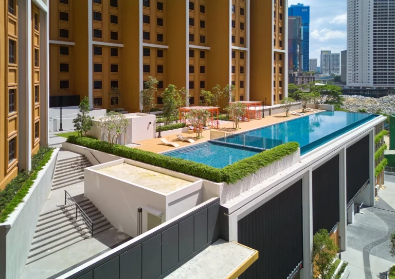
D’Vine Residences sets a new standard for contemporary high-density urban living through its refined architecture, thoughtful use of colour, and focus on community integration.
D’vine Residences
This iconic landmark not only fulfills functional and aesthetic goals but also contributes significantly to the evolving identity of Central Park Damansara.
"In this project, colour was used to establish a strong architectural identity while fostering a sense of warmth and familiarity. Inspired by classic red brick facades, the earthy tones anchor the building within its urban and natural context, creating a timeless yet contemporary appeal. The strategic interplay of contrasting hues enhances depth and scale, emphasizing the tower’s verticality. Simultaneously, the cohesive palette unifies diverse functions—retail, residences, and podiums—ensuring a seamless, visually engaging experience that resonates with its inhabitants and the broader community."