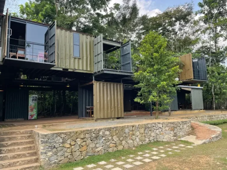
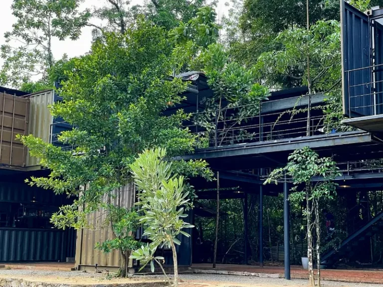
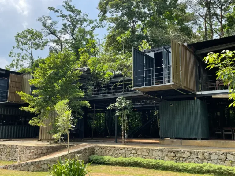
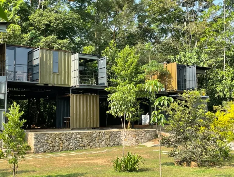
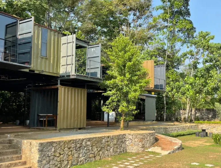
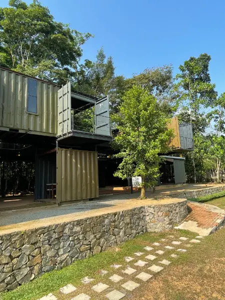
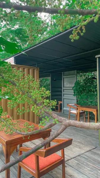
The design of Nosh 77 integrates a variety of spaces: intimate private nooks, slender elevated walkways nestled among the trees, a central courtyard connecting these elements, and a spacious welcoming garden at the building's front. Emphasizing the nature of recycled construction, materials were minimally altered to preserve their original raw, rustic, and aged character. While maintaining the tactile rawness of the materials, paint was employed as a technique to introduce novelty and create a balance between age and timelessness. Material handling prioritized the preservation of the structure's inherent rawness, while carefully chosen colors enhance the visual connection between nature, occupants, functions, and spaces.
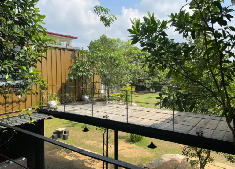
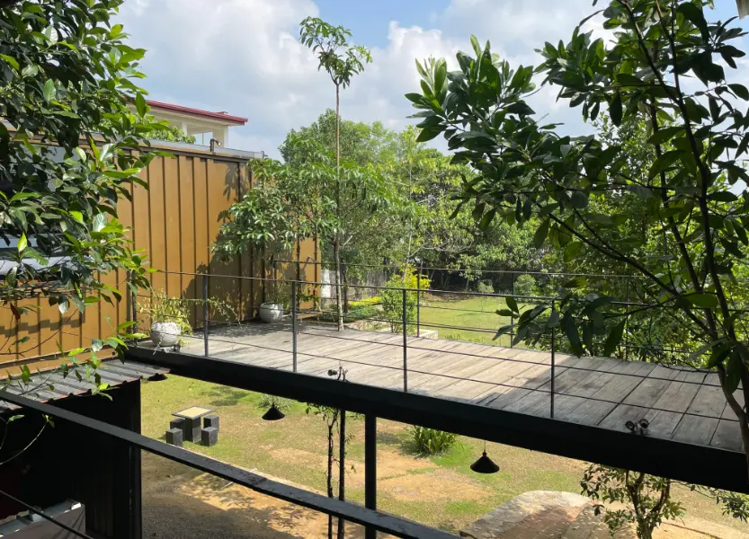
The flooring consists of reclaimed railway sleepers, left uncut and unpolished to retain their rustic, matte texture. Painted in a grey-green hue, they harmonize with the surrounding vegetation, establishing a visual link.
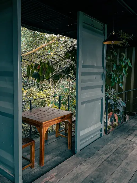
Recognizing the typically heavy and rugged nature of shipping containers, the design aimed to soften this rigidity through an asymmetrically balanced and playful composition featuring both independent and cantilevered containers, thus retaining the essence of their hollow box form. The containers' aged and metallic texture is intentionally preserved, with dents serving as a reminder of their recycled origin. The corrugated walls exhibit valleys and peaks, creating dynamic depth through the interplay of light and shadow. The texture and sheen of the walls shift with variations in light intensity and direction, an effect enhanced by the use of balanced color tones to accentuate the texture's depth.
Located in Western Province, Sri Lanka
Submitted by Nadun S. Saputhantri
Finalists 2025, Winner 2025
Colour Codes
The exterior color palette of olive-greenish, brown-orange, and blue-grey offers a soothing combination, custom-blended on-site. The intention behind these exterior colors was to integrate the structure seamlessly with its surroundings, achieving a camouflaged effect amongst the trees and vegetation. These specific colors were inspired by the artwork “1917 Poster for the US Marines” by J.C. Leyendecker, as featured in Katie Greenwood's book “100 years of color,” specifically chosen to create this camouflage.
In contrast, the interior of the containers is painted in a dark blue-grey. This darker interior serves to focus attention outward, highlighting the lush greenery and strengthening the individual connection each private space has with the natural environment.
Given the restaurant's BYOB policy, the atmosphere becomes more vibrant in the evenings. As twilight descends, the exterior colors interact with the yellow sunlight, intensifying their inherent warm undertones and enriching the evening ambiance through enhanced color saturation.
Nosh77 Container Restaurant
Within the private dining areas, the dark interior colors recede, allowing the warm-white interior lighting to emphasize the diners and the food. The interplay of light and facial shadows creates an intimate setting.
"In this project, colour was used to highlight the function of the restaurant, mainly by setting the structure as a backdrop for the functions. The chosen color palette merged the structure with the surrounding vegetation, giving a camouflaged effect. Generally, vivid, primary colors highlight a structure, and our chosen color palette does the opposite of that, becoming one with nature. The presence of the natural surroundings, people and their activities are more prominent than the structure itself. This creates intimate yet communal, free-flowing spaces harmonized with nature."