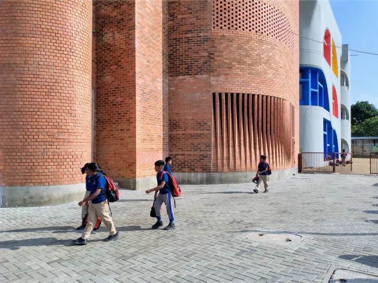
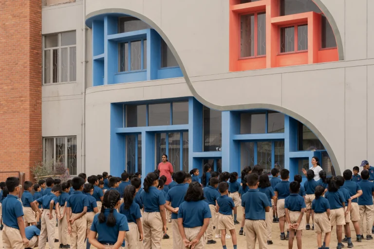
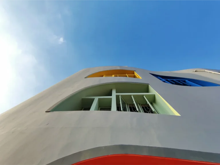
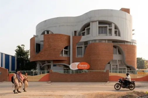
In this project, colour was used to shape how children perceive and navigate space. Vibrant hues—blues, corals, yellows, and greens—animate classrooms, corridors, and the central staircase, transforming everyday circulation into playful landscapes. The staircase becomes a colourful spine guiding movement across levels, while bold window frames punctuate the façade with rhythm and identity. Balanced by the warmth of the brick façade, the palette creates a joyful yet grounded environment that encourages curiosity, comfort, and discovery for young learners.
Background
Located in the rapidly growing neighbourhood of Kuniyamuthur, Harvee School was envisioned as an alternative model for primary education within the community. Many schools in the surrounding area operate in modest, utilitarian buildings where classrooms and corridors function purely as service spaces, with little consideration for the sensory and emotional needs of young learners.The founders of Harvee School sought to challenge this condition by creating an environment where learning extends beyond the classroom. Their journey began in a small factory shed, where a handful of students experienced a more engaging and interactive approach to education. The response from the local community was immediate and enthusiastic. As enrolment increased, the founders took the bold step of developing a purpose-built campus that could embody their educational philosophy.
The new building was therefore conceived not merely as a school, but as an environment that encourages curiosity, interaction, and exploration. Colour became a central design strategy in shaping how students experience and move through the building.
Located in Tamil Nadu, India
MURALI ARCHITECTS
Finalists 2026, Winner 2026
Colour Codes
Concept
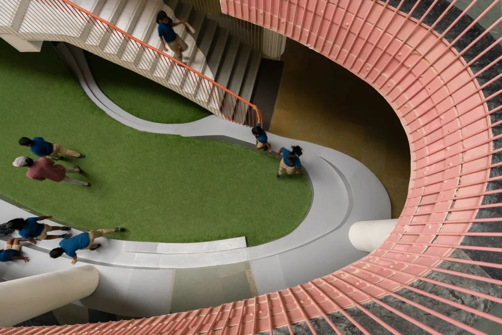
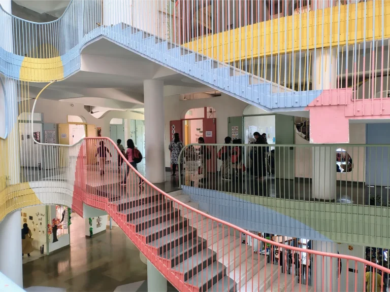
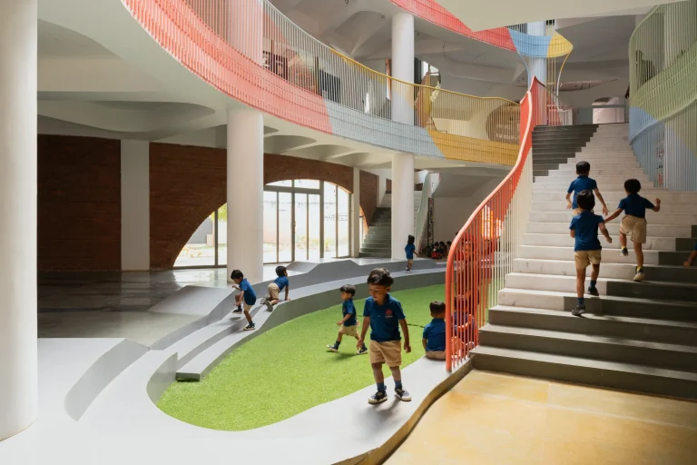
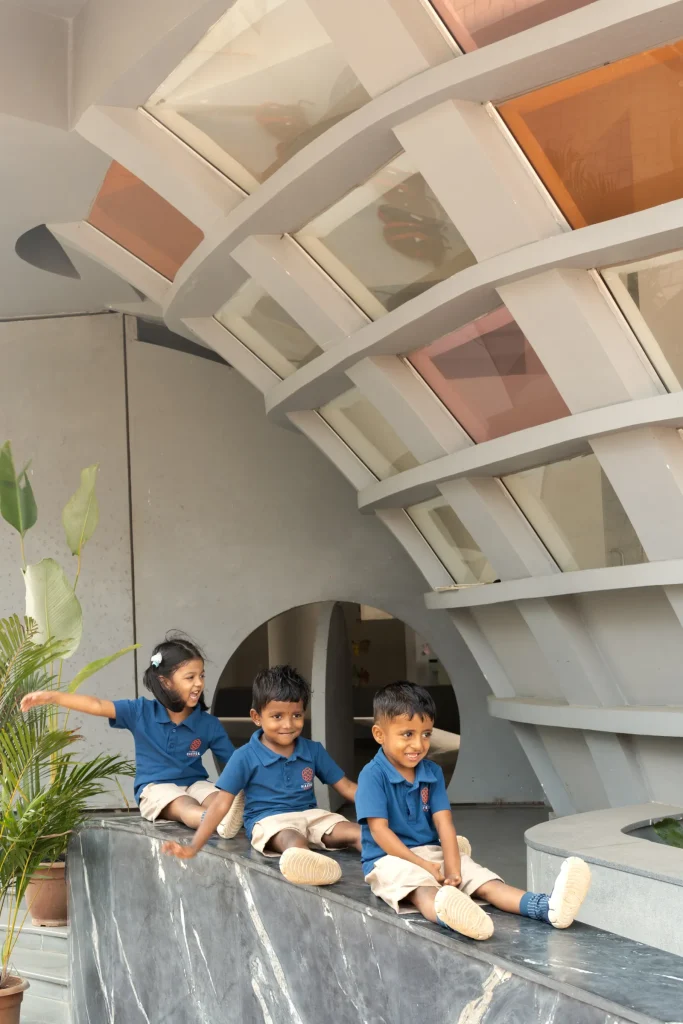
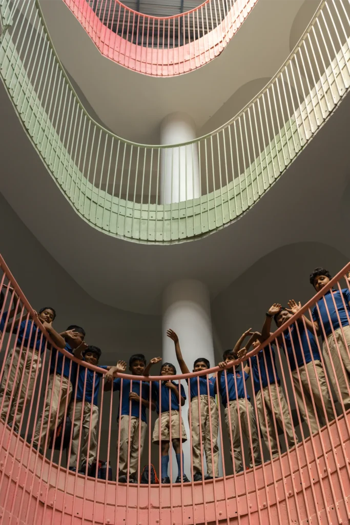
The architectural concept centres on transforming circulation spaces into active learning environments. Instead of conventional corridors and staircases, the building is organised around a vertically connected atrium where movement becomes a shared and visible experience.Layered balconies, staircases, and walkways wrap around the central void, allowing students to see activity across different levels. This spatial openness encourages interaction and strengthens the sense of community within the school.
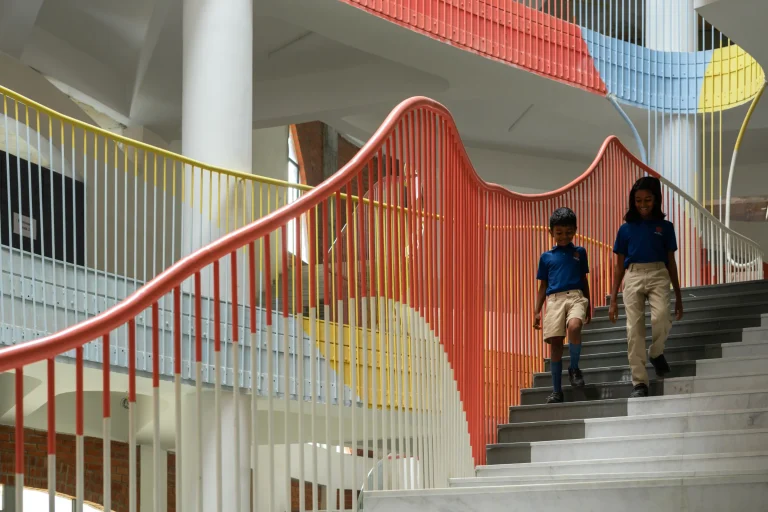
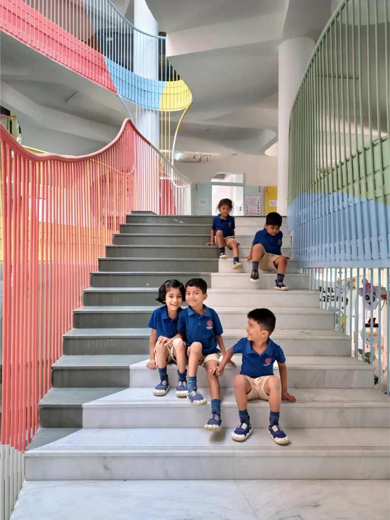
Within this framework, colour becomes an integral architectural element rather than a decorative layer. Flowing bands of coloured railings trace the movement of staircases and balconies, creating a continuous visual rhythm throughout the building. These curved lines echo the spontaneity and energy of childhood while subtly guiding students through the spatial sequence of the school.
Colour Story
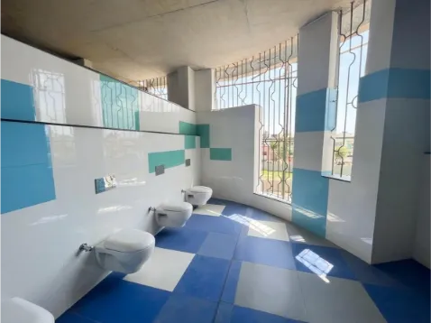
The colour palette draws inspiration from the vibrancy and optimism associated with childhood. A balanced range of hues—including coral, yellow, sky blue, and soft green—animates the circulation elements of the building. Instead of covering entire surfaces with colour, the design concentrates colour along architectural edges and movement paths. Stair railings and balcony guards become expressive ribbons that weave through the atrium, visually connecting different levels and reinforcing the flow of movement.
Warm tones introduce energy and playfulness to shared spaces, while cooler hues create moments of calm and visual balance. Set against exposed concrete and neutral surfaces, the pastel palette appears lively yet harmonious.
The Harvee School
In this project, colour was used to shape how children perceive and navigate space.
Impact
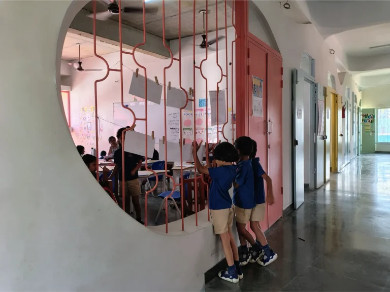
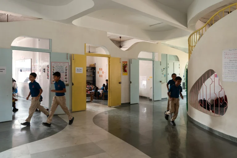
The colour strategy transforms circulation spaces from simple transitional zones into active social environments where students gather, observe, and interact.Colour also functions as an intuitive wayfinding system. Distinct coloured railings help children recognise different levels and navigate the building confidently, encouraging independence and spatial awareness.
The vibrant palette creates an atmosphere that feels joyful, welcoming, and stimulating. Students extend their learning beyond the classroom—reading along corridors, interacting across levels, and exploring the building as a place for discovery.
Ultimately, the project demonstrates how colour, when thoughtfully integrated into architecture, can transform an educational building into a dynamic learning environment that nurtures curiosity, creativity, and community.
The colour palette draws inspiration from the vibrancy and optimism associated with childhood.