

The Harvee School
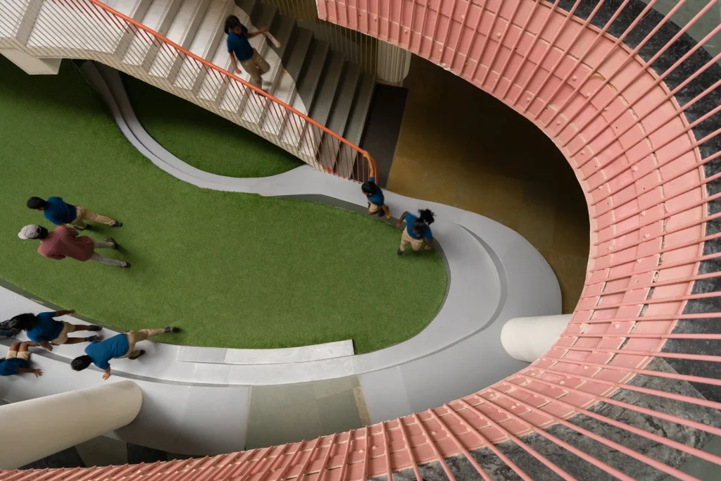
In this project, colour was used to shape how children perceive and navigate space. Vibrant hues—blues, corals, yellows, and greens—animate classrooms, corridors, and the central staircase, transforming everyday circulation into playful landscapes. The staircase becomes a colourful spine guiding movement across levels, while bold window frames punctuate the façade with rhythm and identity. Balanced by […]
Epoca
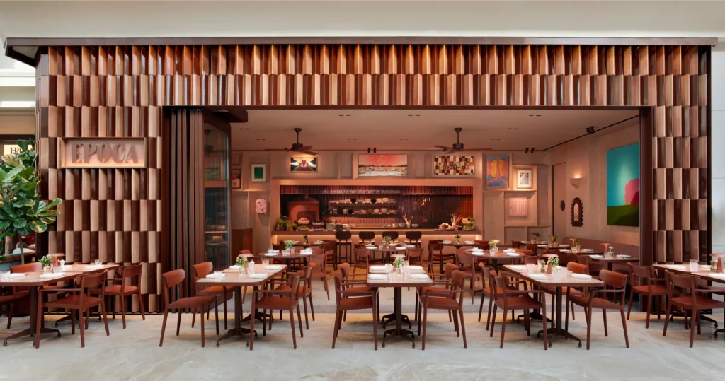
In this project, colour was used to reinterpret the warmth and vibrancy of Latin American culture through a soft, harmonious palette. Designed to support both daytime dining and evening ambience, the scheme enhances comfort and emotional connection. Inside, natural tadelakt plaster and the integrated kitchen counter tones create warmth and cohesion. Outside, a green bar […]
Matou House
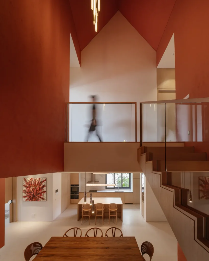
In this project, colour was used as an architectural device to define the spatial and emotional core of the home. A terracotta-red stairwell void anchors the house vertically, intensifying the chapel-like proportions and transforming functional circulation into a emotional height. Set against a neutral palette that allows daylight and greenery to dominate the living areas, […]
Flo by Sansiri
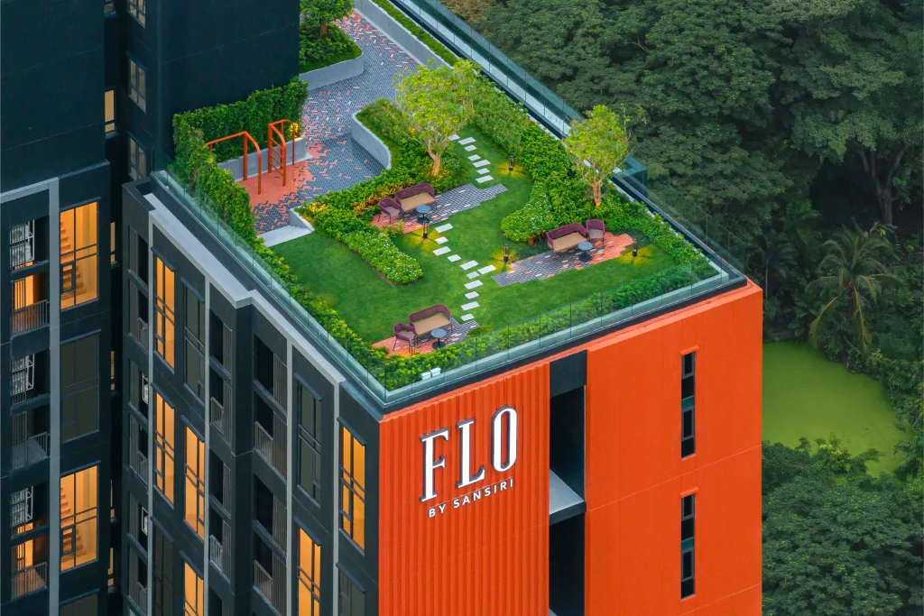
This project draws inspiration from the character of the Khlong San,where brick was once a predominant material used in local architecture. This heritage is reinterpreted through the project’s signature brick-orange palette, which becomes the primary color. The tone creates a distinctive architectural identity while subtly embedding the cultural roots of Khlong San into the design. […]
HHOM – Nurse Hostel @ 1A Short Street, managed by TSTAP
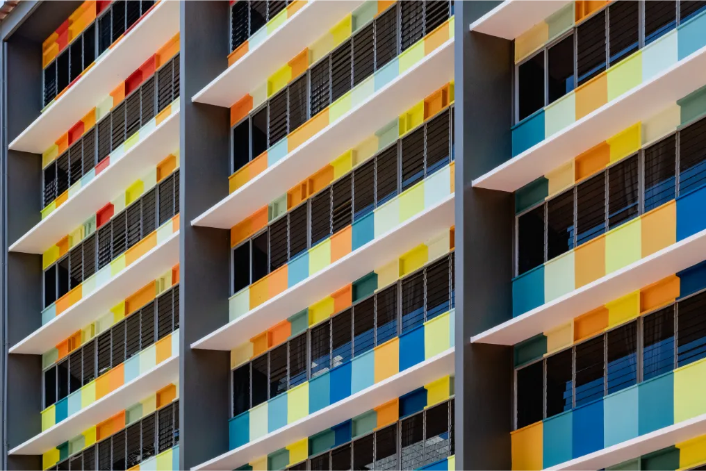
In this project, colour was used to represent the multitude of colours found in the different nurse uniforms in Singapore, each having their own colours of sleeves, collars and buttons and the result is an expression of unity in colours that symbolize the unity amongst the nurses of different races, nationalities, religions and cultures, working […]