In this project, colour was used as a quiet language of balance and flow. Earth-toned hues drift through the home, shaping spaces of stillness and gathering without the need for walls. Deeper shades anchor moments of rest within The Dune, while lighter tones draw warmth and life into The Hearth. Guided by the S-shaped ceiling, colour gently connects spaces, turning daily living into an experience of calm, rhythm, and belonging.
EMBRACING EARTH & LIGHT
Background
Serra House is a private residential interior project located in Malaysia, conceived as a calm yet expressive home for contemporary living. The project explores how colour, form, and materiality quietly shape daily rituals — from rest and reflection to gathering and shared moments. Rather than relying on decorative excess, the design focuses on spatial clarity, tactile surfaces, and controlled light to create a home that feels grounded, intuitive, and enduring.
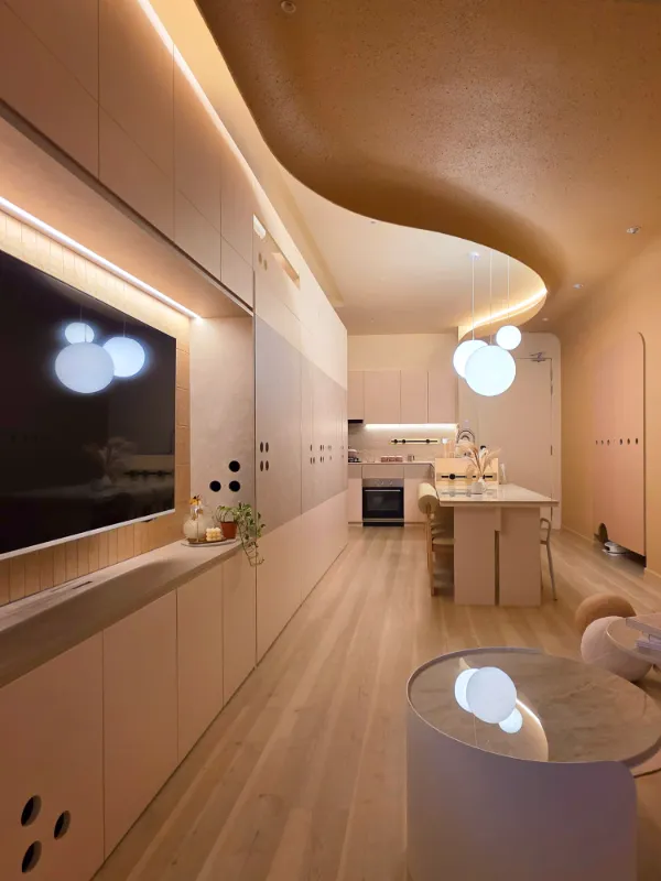
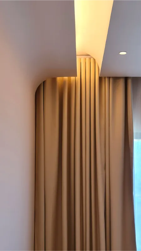
At the heart of the project is an S-shaped ceiling that gently flows across the main living spaces. This defining gesture organises the layout while setting the tone for how colour and atmosphere are experienced throughout the home. Serra House is envisioned as a living landscape — one that evolves with movement, time, and light.
Located in Kuala Lumpur, Malaysia
TKCA ARCHITECTS SDN BHD
Finalists 2026
Colour Codes
Concept
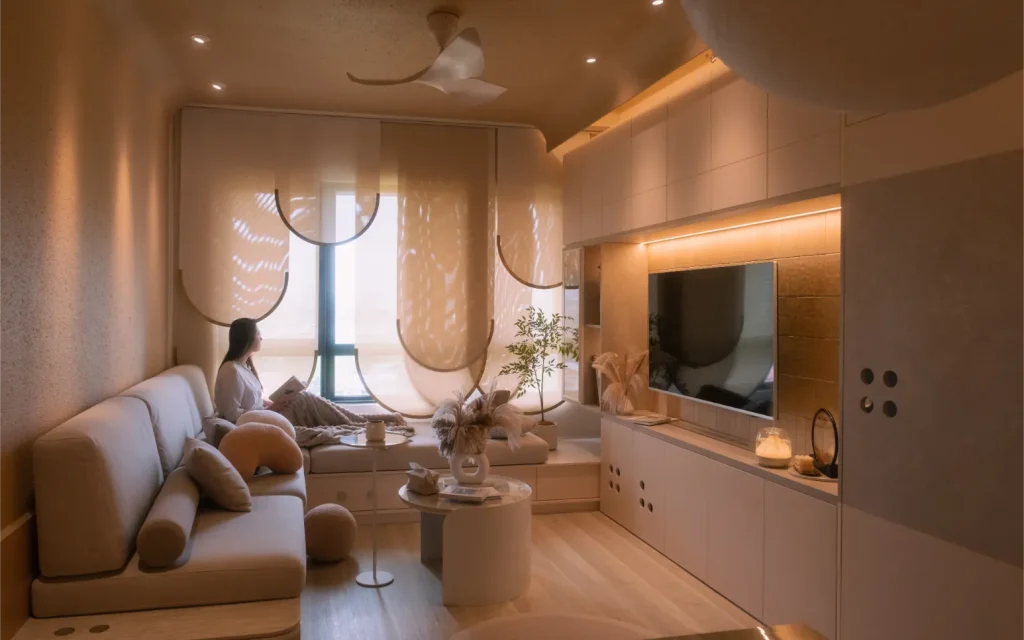
Serra House explores the balance between stillness and activity through two interconnected spatial zones: The Dune and The Hearth.
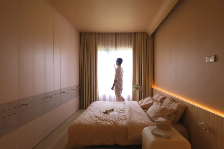
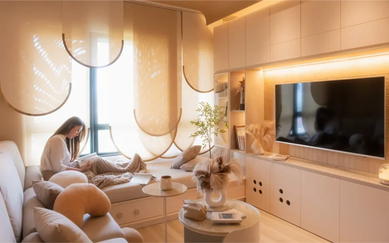
The Dune comprises the living and master areas, conceived as tranquil, grounding spaces defined by soft curves, muted tones, and tactile finishes that support rest and retreat.
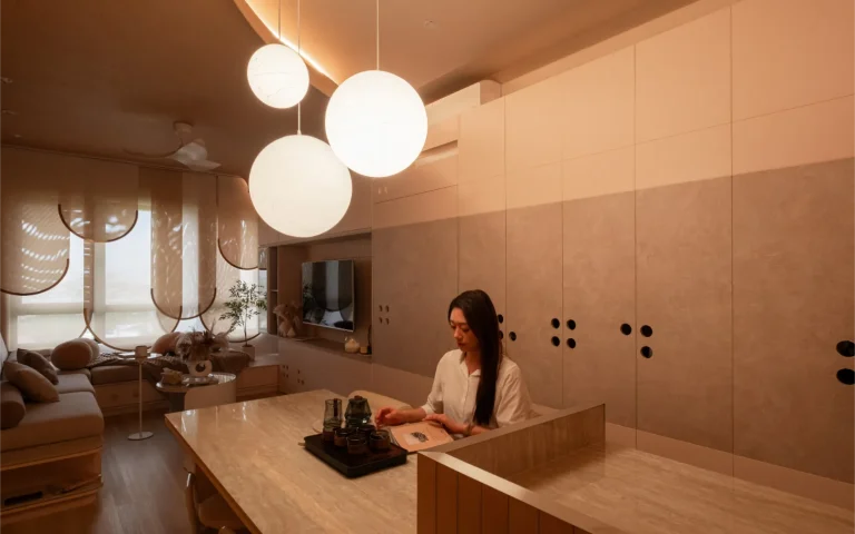
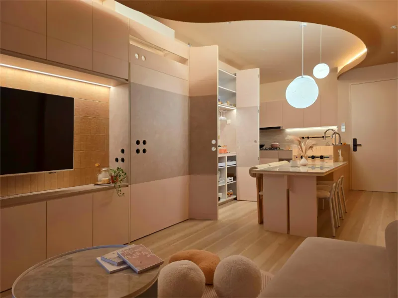
The Hearth forms the home’s communal core, accommodating the dining and kitchen spaces where warmth, interaction, and daily life naturally converge.
An S-shaped ceiling weaves through the home, acting as a continuous transition between these zones. Rather than separating functions with walls, the design relies on form and colour to define atmosphere, allowing each space to remain distinct yet seamlessly connected.
Colour Story
The colour palette of Serra House is rooted in earthy neutrals — ranging from deeper sand and warm beige tones to lighter, sun-washed hues. Rather than relying on strong contrast, the palette works through subtle gradation, echoing natural terrains shaped over time.
Darker, richer beige tones are used within The Dune to enhance a sense of enclosure and calm. These hues pair with textured wall finishes and warm flooring to reinforce stillness and comfort. Lighter beige tones define The Hearth, reflecting light more freely and encouraging openness within communal areas.
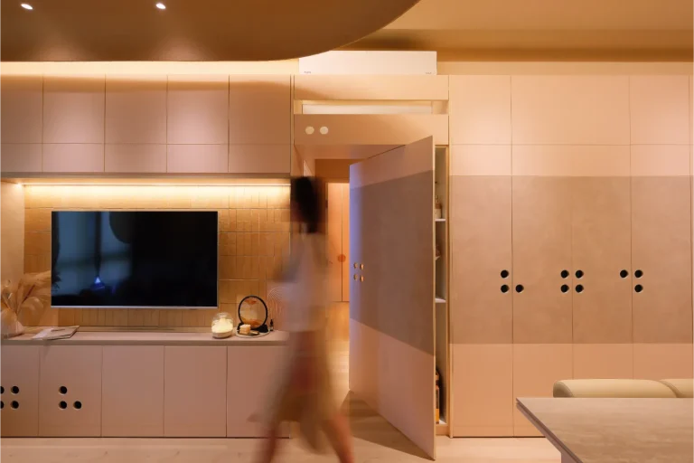
The S-shaped ceiling reinforces this colour zoning, with tonal shifts marking transitions without visual interruption. Circular details — appearing as openings, handles, and surface punctuations — further soften edges and introduce moments of lightness within the palette. Together, colour and form operate quietly, supporting spatial intent rather than overpowering it.
Serra Haus
In this project, colour was used as a quiet language of balance and flow.
Impact
The colour strategy transforms Serra House into a home that feels intuitively balanced. Functionally, colour guides users through different zones without the need for physical divisions. Spatially, it enhances continuity and depth, allowing the home to feel fluid and cohesive.
Emotionally, the palette fosters comfort and familiarity. Deeper tones encourage rest and grounding, while lighter hues support gathering and shared moments. By focusing on timeless, earth-inspired tones, Serra House achieves longevity and adaptability.
Ultimately, colour in Serra House is not decorative — it is experiential. It shapes how the home is lived in, how light is perceived, and how moments of stillness and connection naturally unfold.
Together, colour and form operate quietly, supporting spatial intent rather than overpowering it.